Casa Dunose
Happiness is homemade
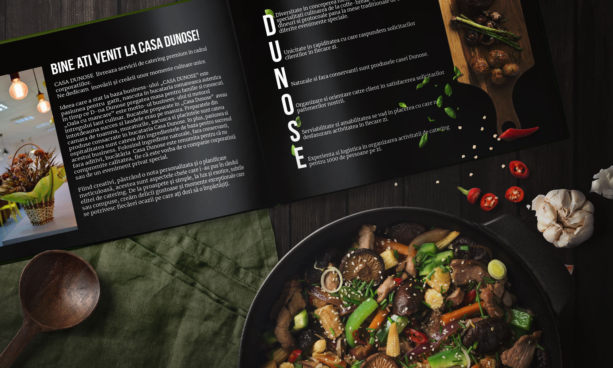
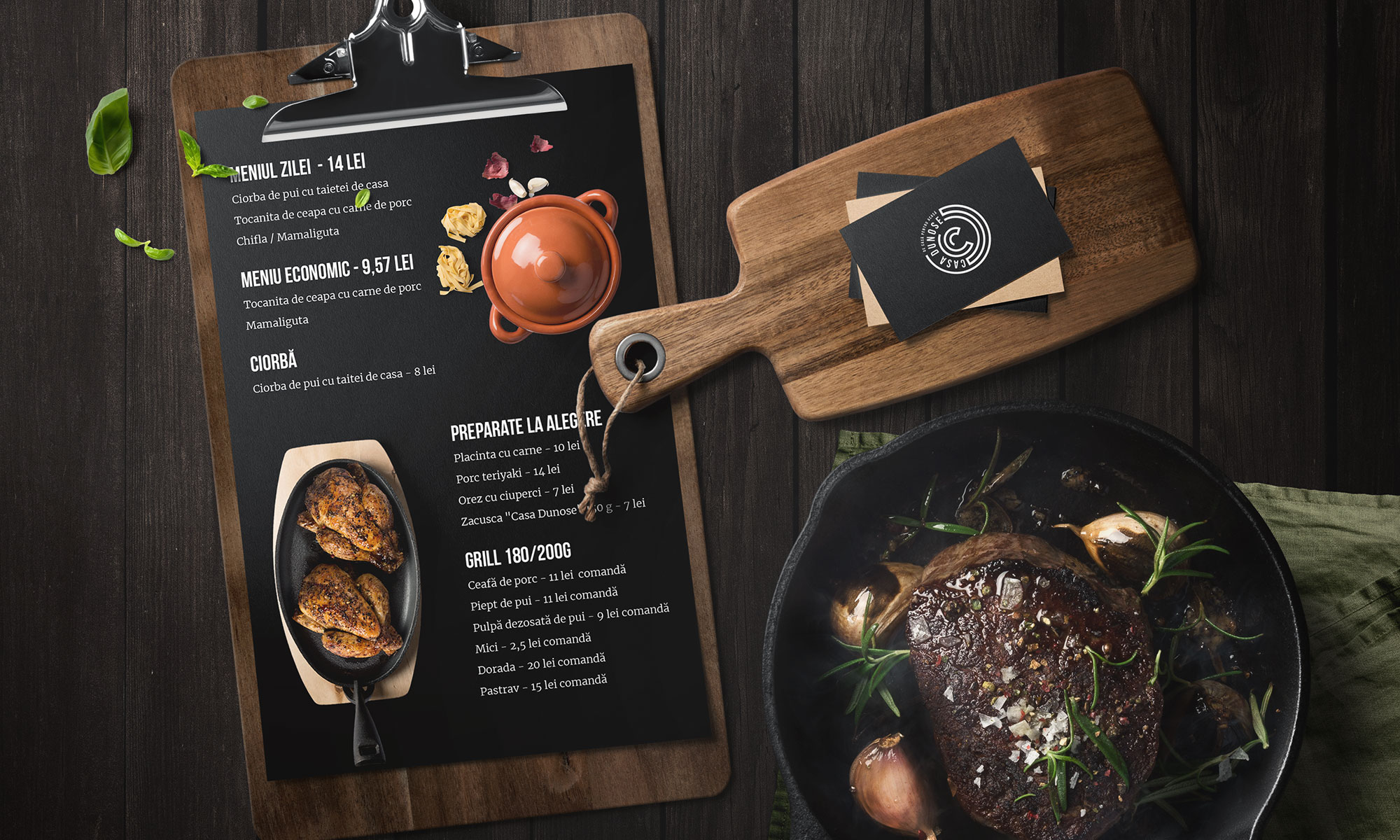
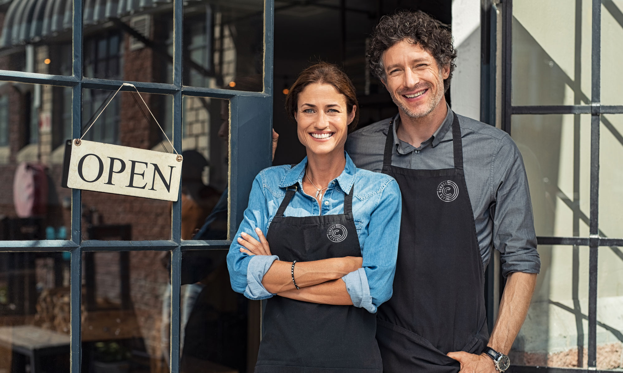
Casa Dunose started as a small family-owned restaurant, but it has grown to be a professional business that also provides catering services. Even though they have hundreds of satisfied customers and business partners, they maintain their traditional approach – happiness is homemade.
The visual identity is developed to emphasize the name of the brand and the core values behind it. The logo consists of intertwined letters C and D, forming a maze to symbolize the idea that all roads lead back home.
Client
- Casa Dunose
Discipline
- Brand Identity