Socket
Power Up
Socket is a web3 infrastructure company that enables liquidity & data movement across chains seamlessly. It acts as a meta-layer that gives protocols connectivity across chains with one single integration.
Based on how and what they do, the name Socket came as a logical solution. In reality, a socket is the one thing that stands between a user’s need (power supply, data transfer, etc.) and an extremely complex electrical grid or a motherboard of a computer.
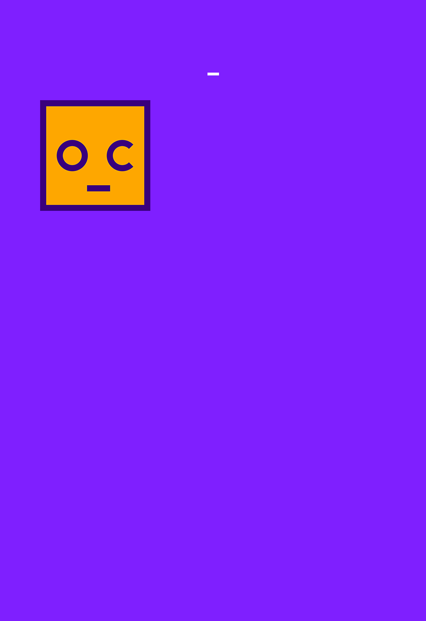
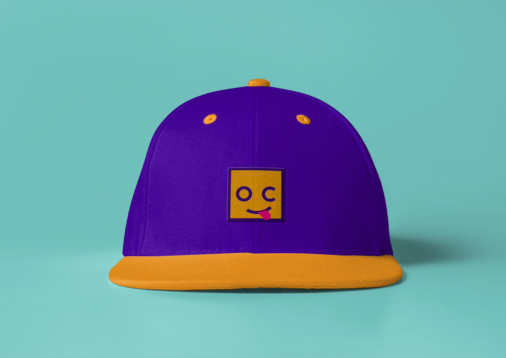
Considering that Socket is all about simplicity, the visual identity had to align with that idea. Therefore, the logo is based on modern typography, and an icon that naturally evolved using the letters O and C. Color scheme is built to reflect their fun-loving and vibrant culture.
Client
- Socket
Location
- Bangalore, India
Discipline
- Brand Identity
- Naming
- Campaign Design
- Digital Design
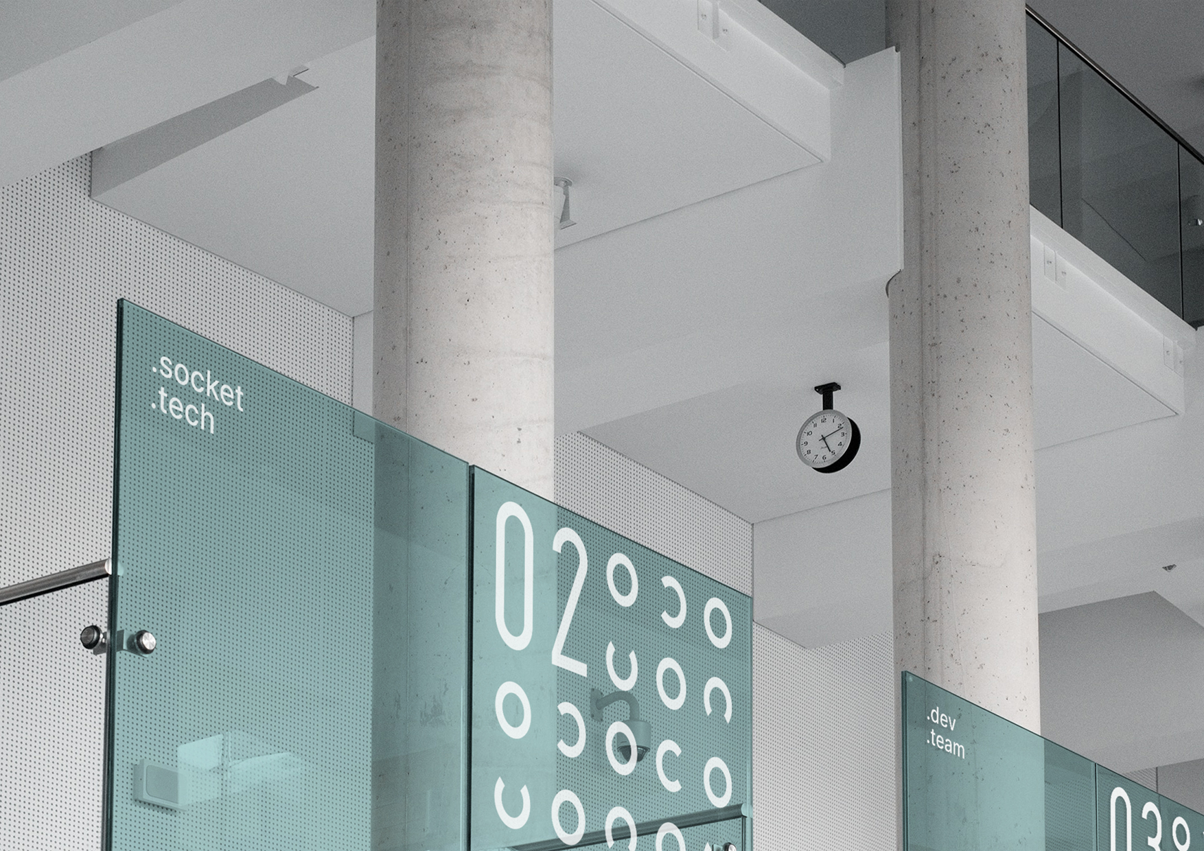
- Environmental Graphics
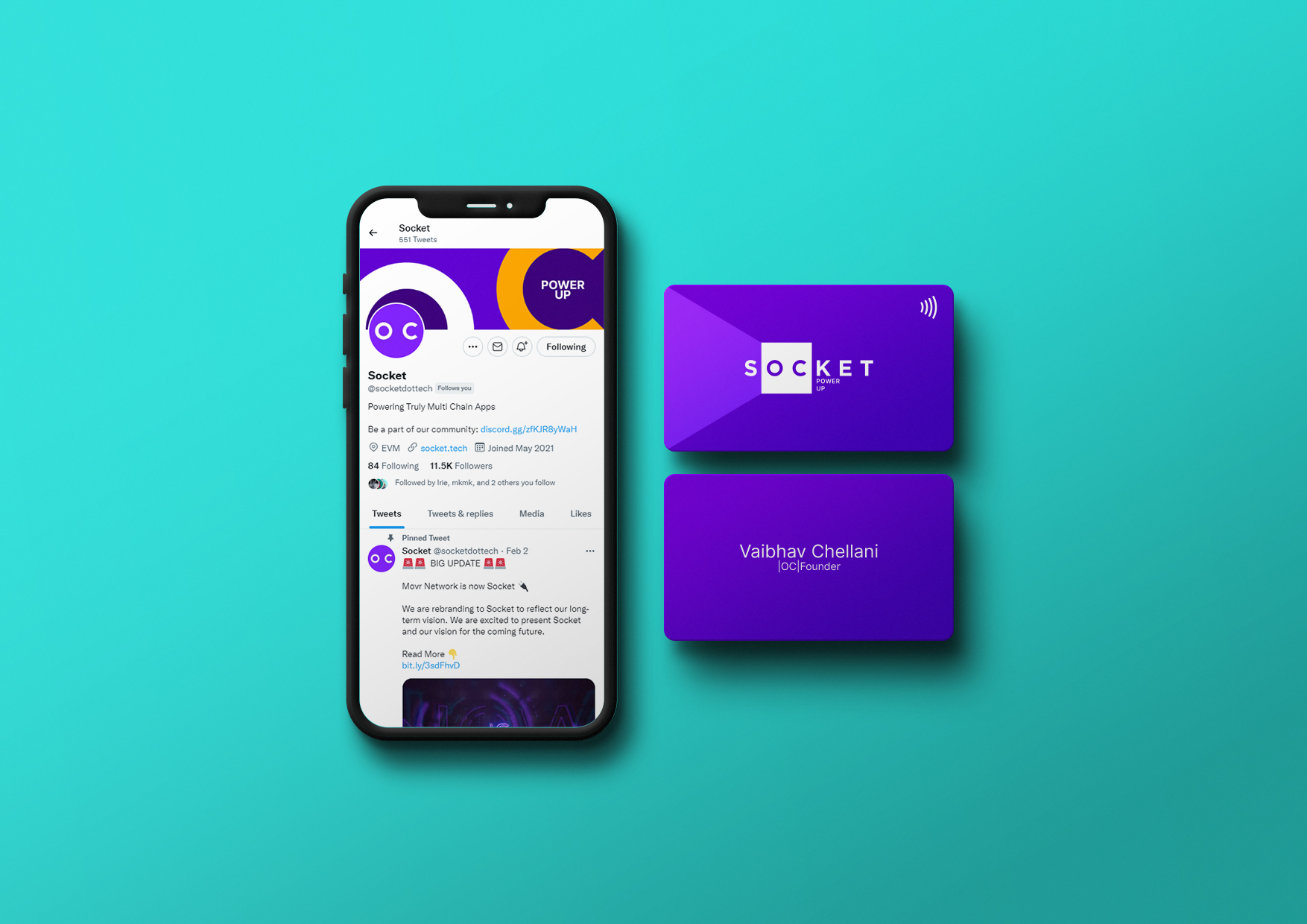

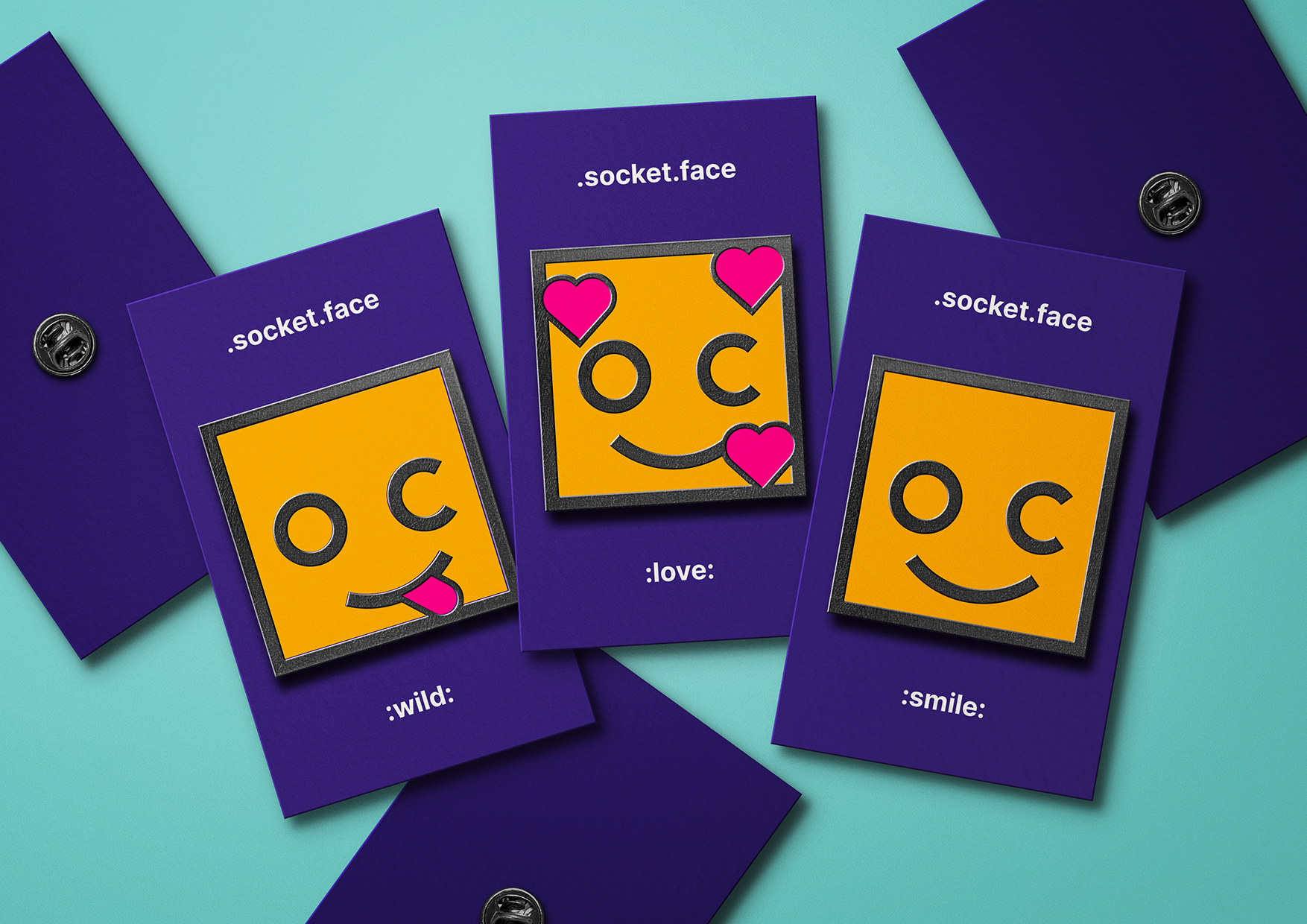
With new technologies come new needs. Web3 company stationary now consists of social media profiles and smart cards, while news and discussions happen on Twitter and Discord. For these purposes, we designed SocketFace - Socket’s own emoji set. That way, we were able to make Socket’s online communication channels unique to them and their community.